

The combinations worth having memorized: red and pink warm, high-energy, and intentionally unconventional. Navy and burgundy deep, rich, and quietly European. Cobalt and white maximum contrast, minimum confusion. Emerald and camel earthy and sophisticated. Purple and grey restrained and considered. Any of these works as a starting point. Once you’ve worn two of them, your instinct for what reads as harmony versus what reads as noise develops on its own.
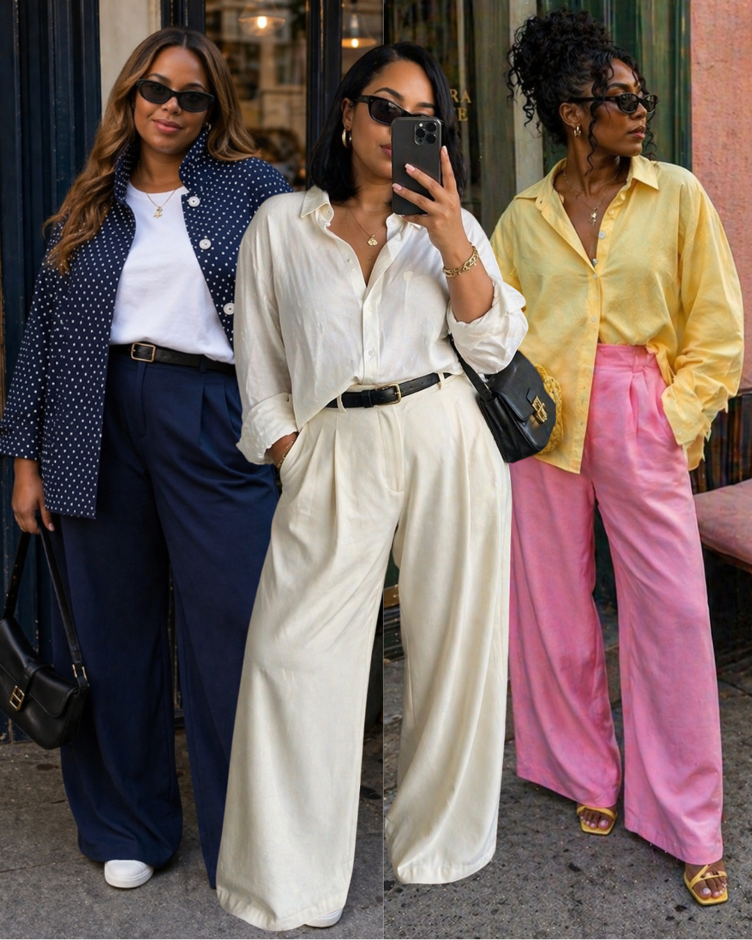
The most common reason color blocking fails is proportion, not the actual combination. When two colors are split 50/50 on the body same-weight top and bottom they compete for dominance and the eye doesn’t know where to go. When one color dominates (roughly 60–70% of the look) and the other accents, the outfit has a clear focal point. That single adjustment will fix most color blocking attempts that aren’t working.
Styling Note: The easiest way to try color blocking without overthinking it: pick one of the combinations above, buy them in the same silhouette (both loose, both tailored, both relaxed), and wear them as a set. The combination does the work; all you have to do is commit to both pieces at once.
If You’re Not Ready — Color Through Accessories
Not everyone is ready to wear cobalt from shoulder to ankle, and that is entirely valid. Color doesn’t have to be worn head to toe to be felt. A single color accessory — a bag, a shoe, a belt, a scarf — introduced into an otherwise neutral outfit creates the same effect in miniature: it gives the eye somewhere to land, signals intention, and starts to build your instinct for which colors you actually gravitate toward.


